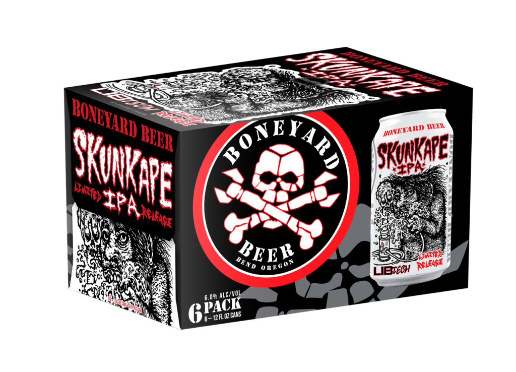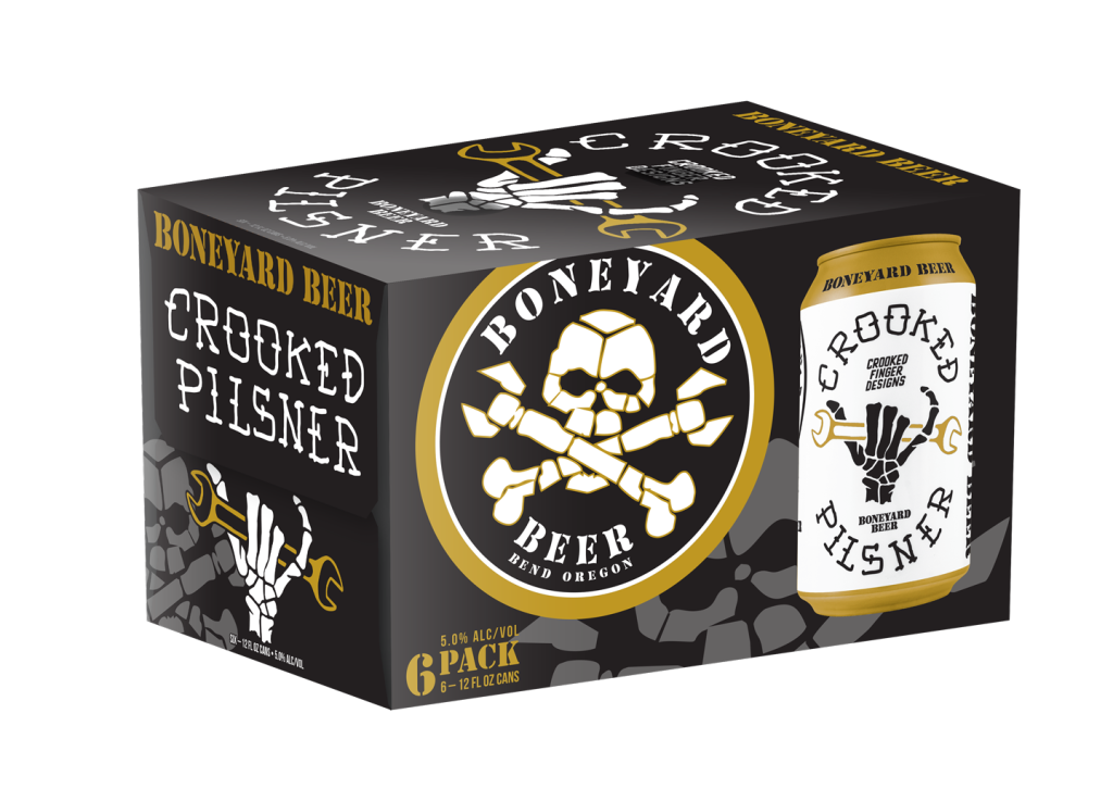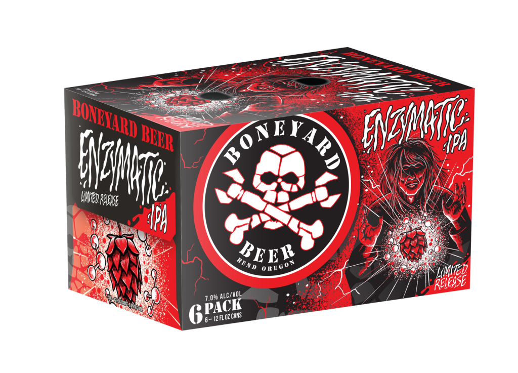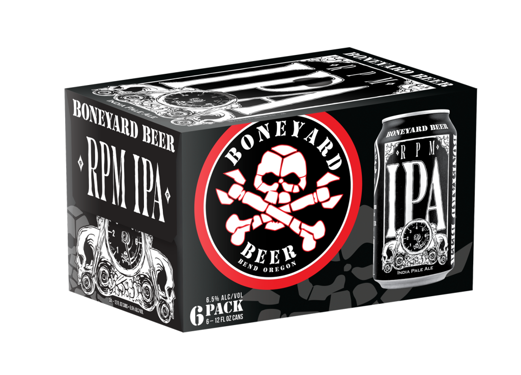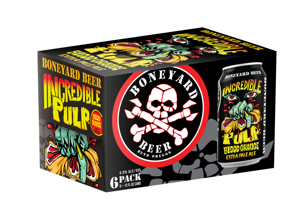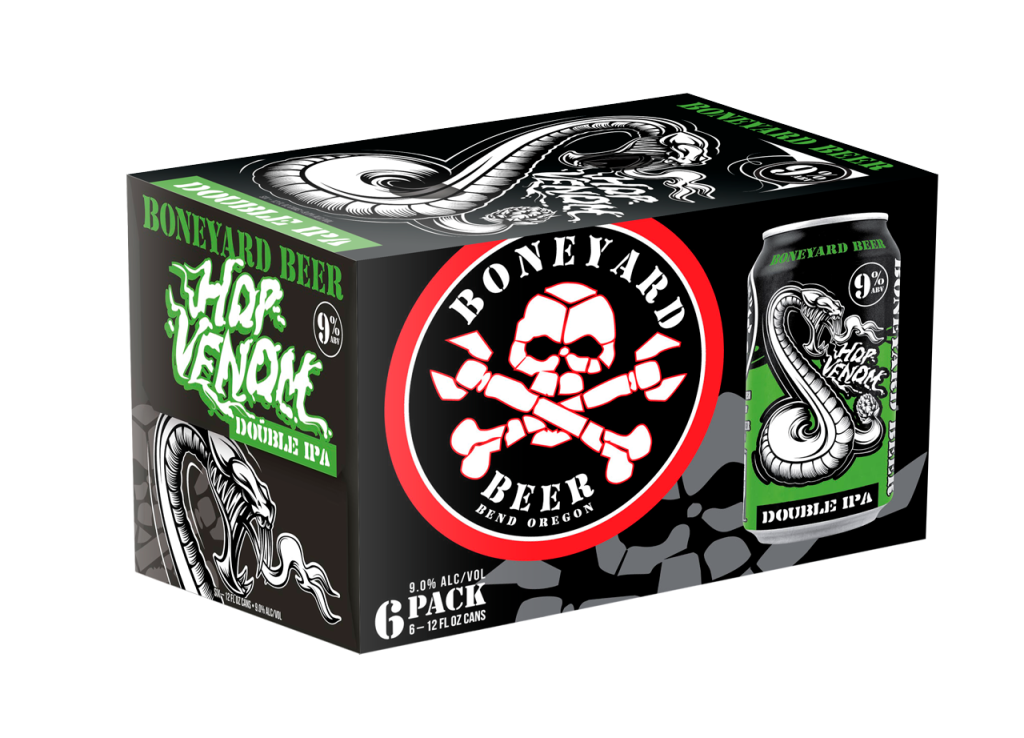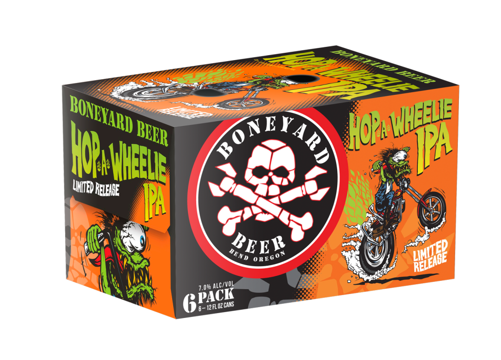
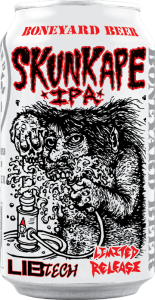

Bottom flap is an edgy look at the key art while the top flap provides succint product indentification.
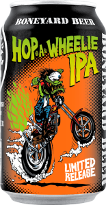
Large top graphic references our punk-rock gig poster roots and broadcasts the product name.
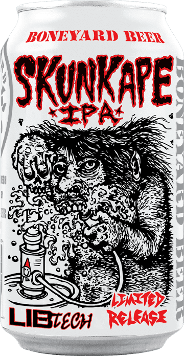
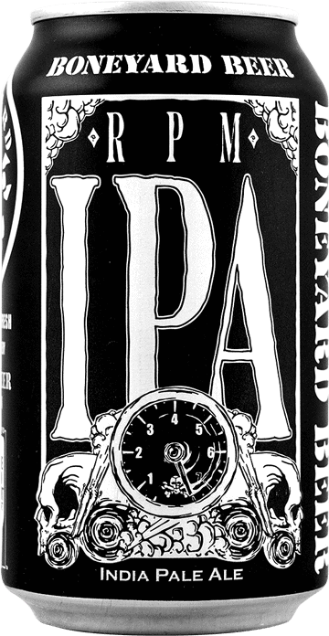
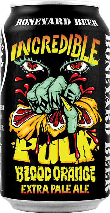
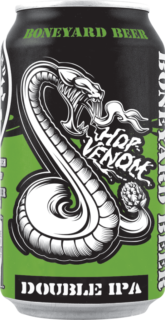
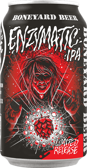
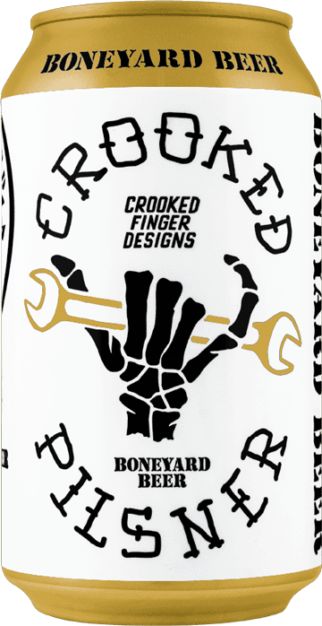
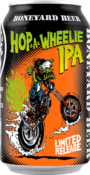
Show what’s inside-- the can image is vital in communicating what customers are purchasing. I even photographed it myself.
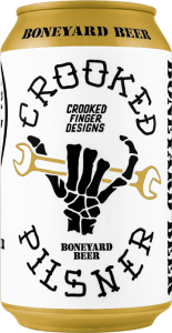
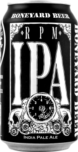
Our brand embodies the rebel persona and we felt good about cropping and rotating our logo.