Dan O's Seasoning
My client was witnessing massive growth while still packaging under their original design system. I collaborated with their brand team to prioritize their most significant brand identifiers, as well as increase identification and allow for new sub-flavor product lines. The changes were successfully implemented for a new launch and our engagement proved to be a fruitful exercise in packaging design system enhancement.
Before & After
There is nothing wrong with a beloved mascot, but, when it contributes to an inefficient use of space, perhaps it is time to reconsider. I was able to leverage the mascot into a whole new formation that offered exciting figure and ground relationship to make this character pop off the shelves.
Packaging Design System
Once the design process was complete and all stakeholders were satisfied, I identified the variables that would change for each variety and flavor.
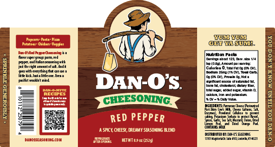
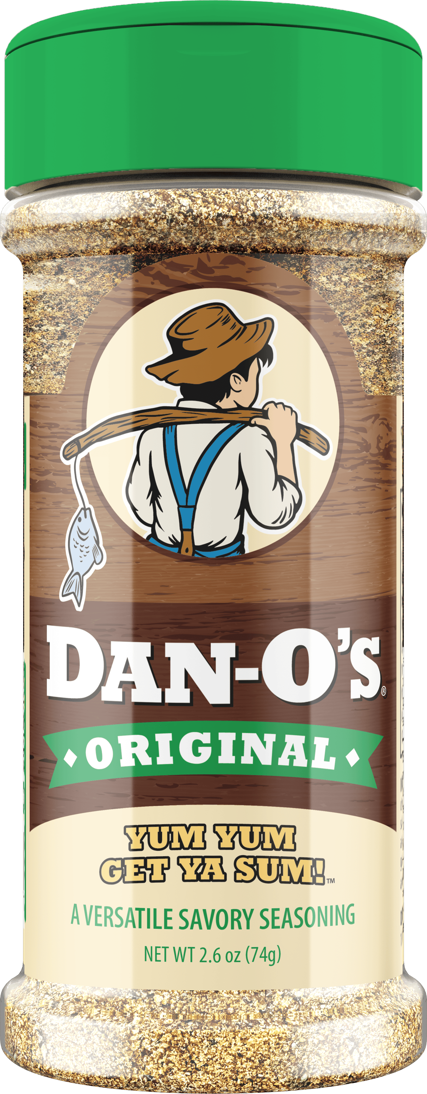
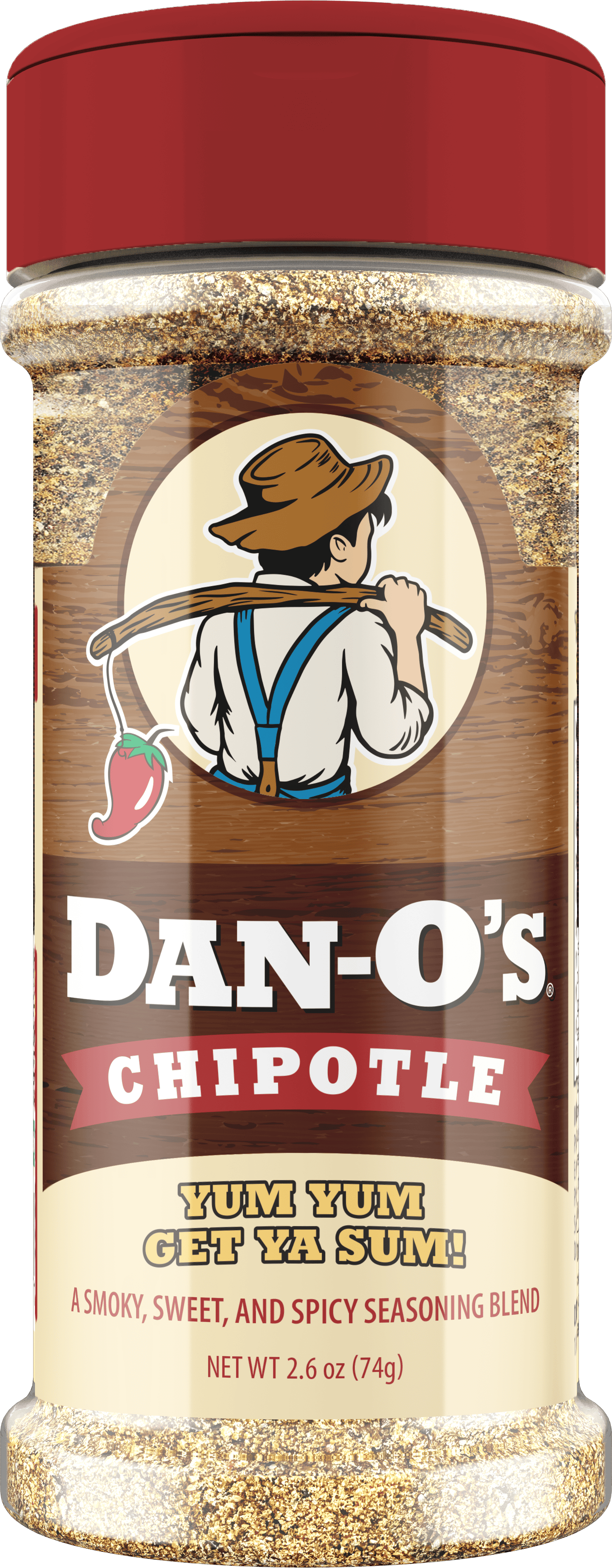
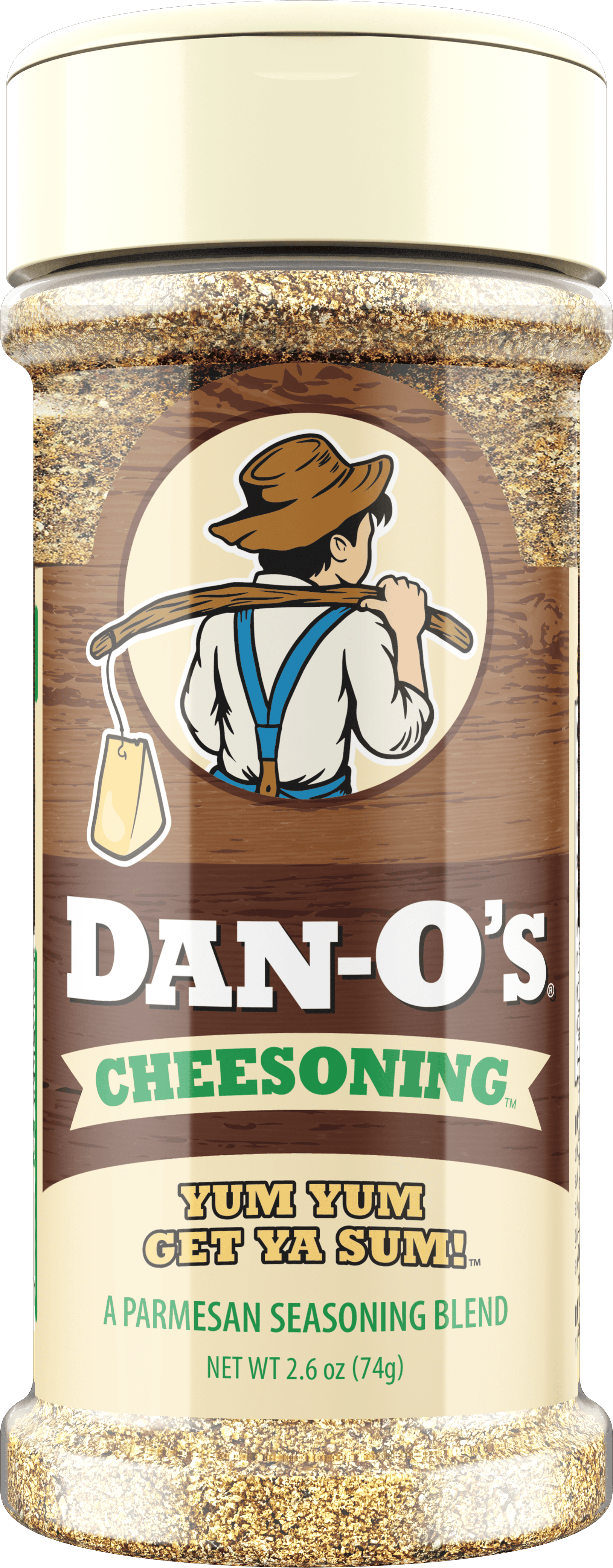
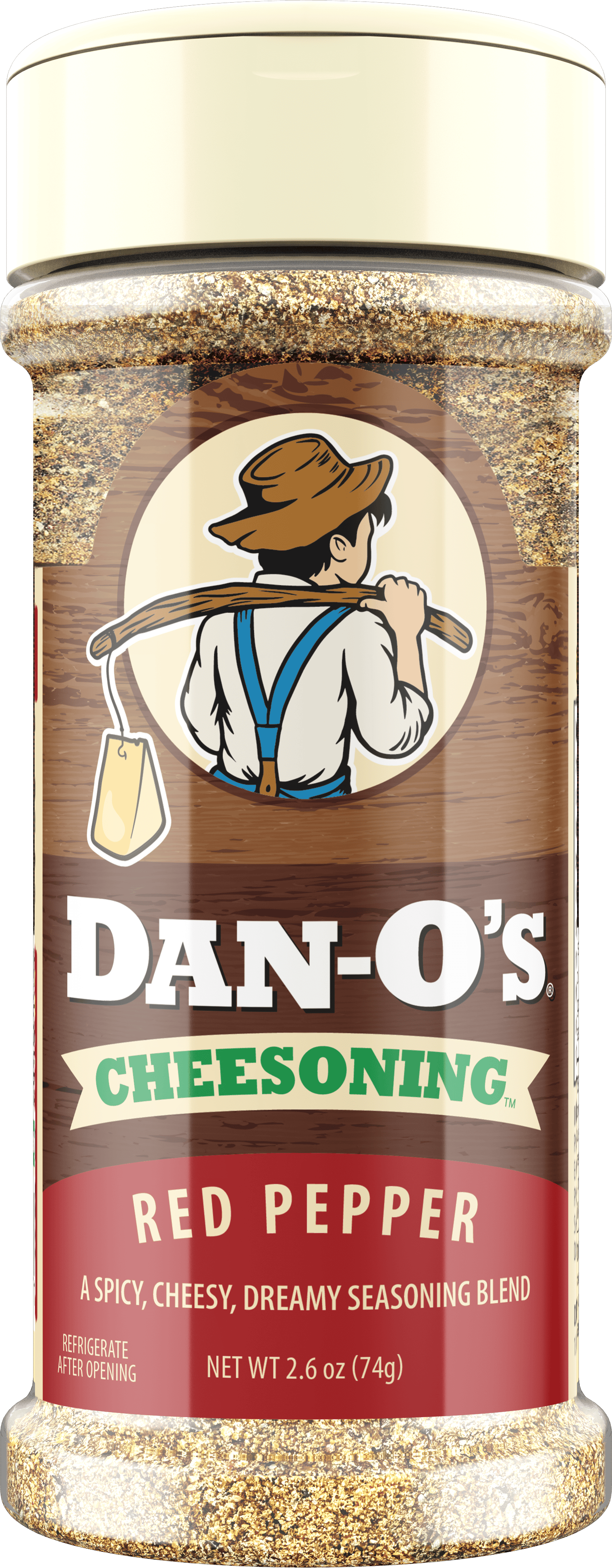
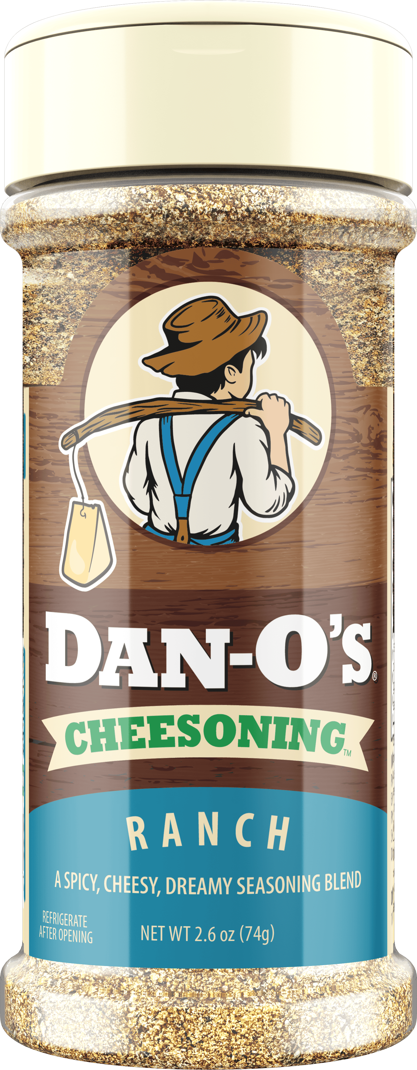
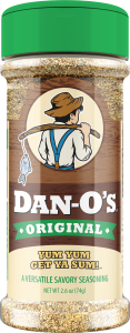
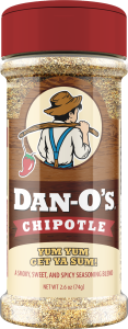
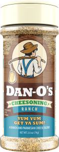
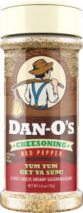
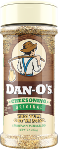
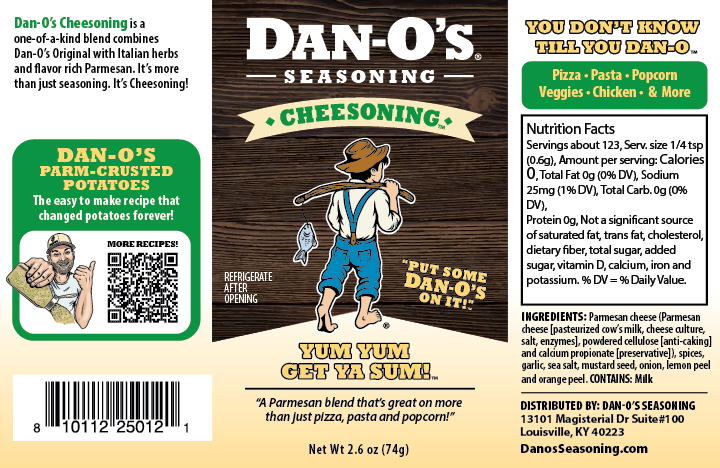
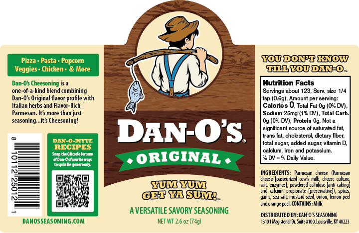
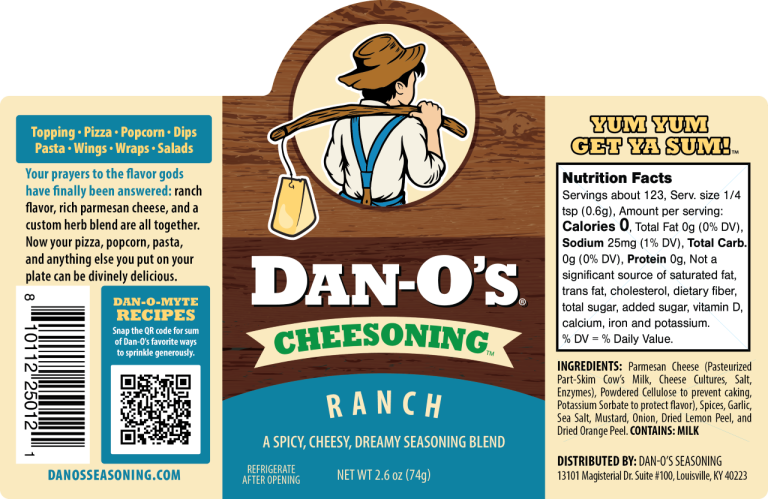
The new die-cut shape also has a seconday effect-- customers are able to witness more of the beautiful spice blend’s color and texture.
A lightened wood texture also worked to improve visibility against dark shelf environments.
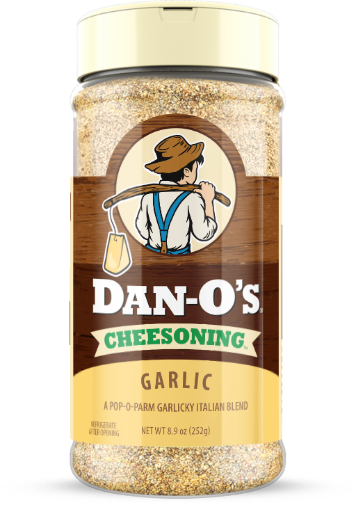
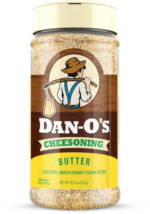
Die-cut label shape further distinguishes label on the shelf. Moreover, the object on the end of our mascot’s fishing pole may change for line extensions.
Sub-flavors exist in the lower portion of the display panel. We will also accommodate a color change in this area.
Container Size Production
It didn’t stop there– I extended the new system to account for various container sizes.
