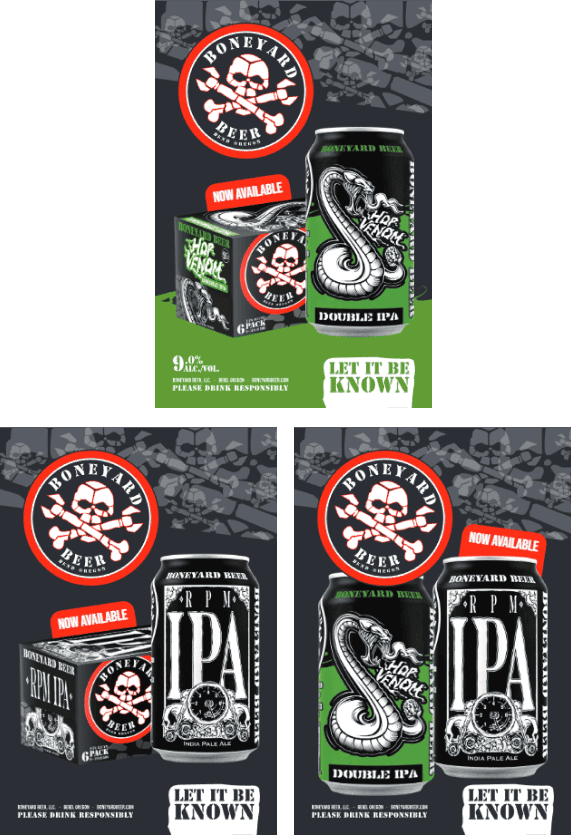
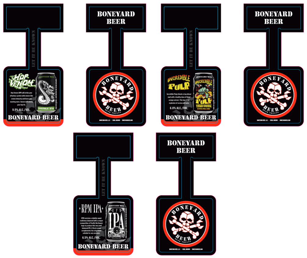
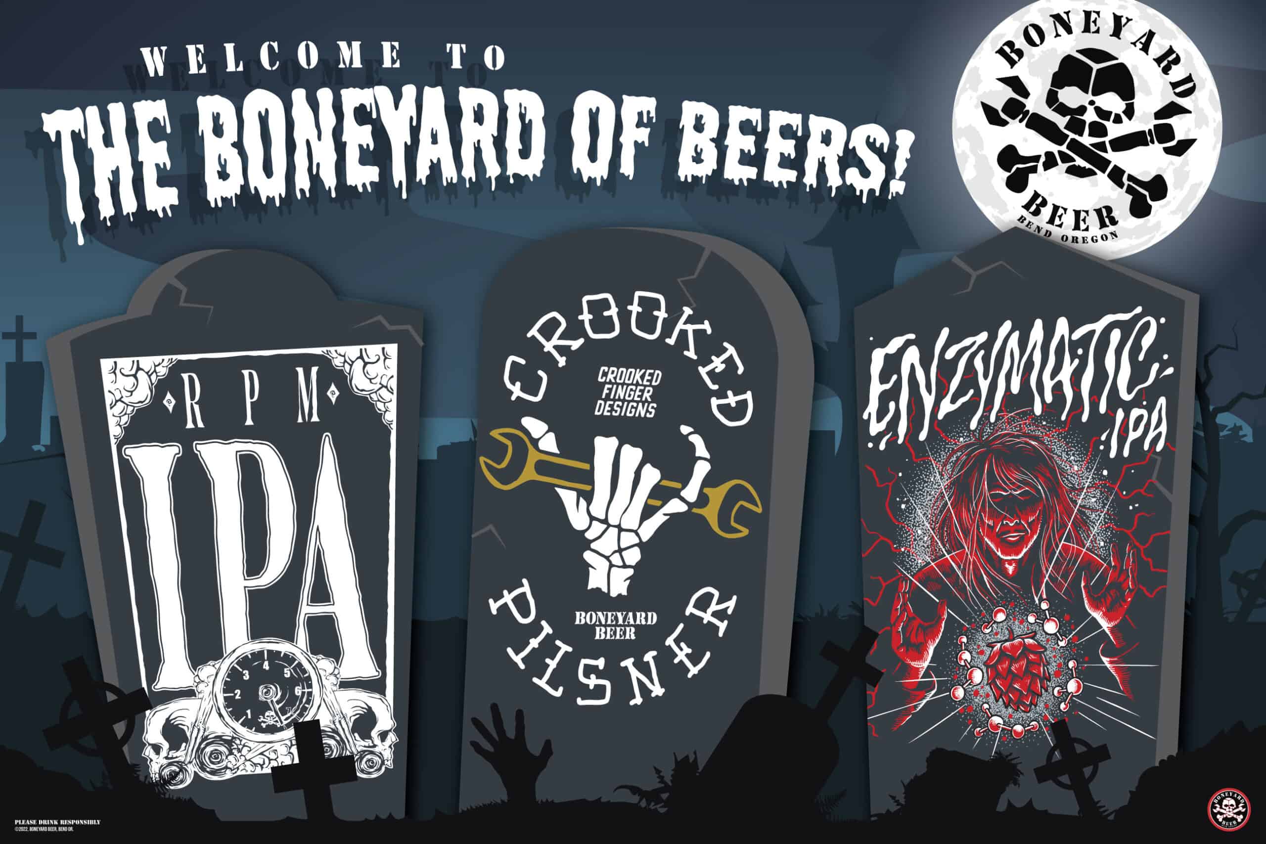
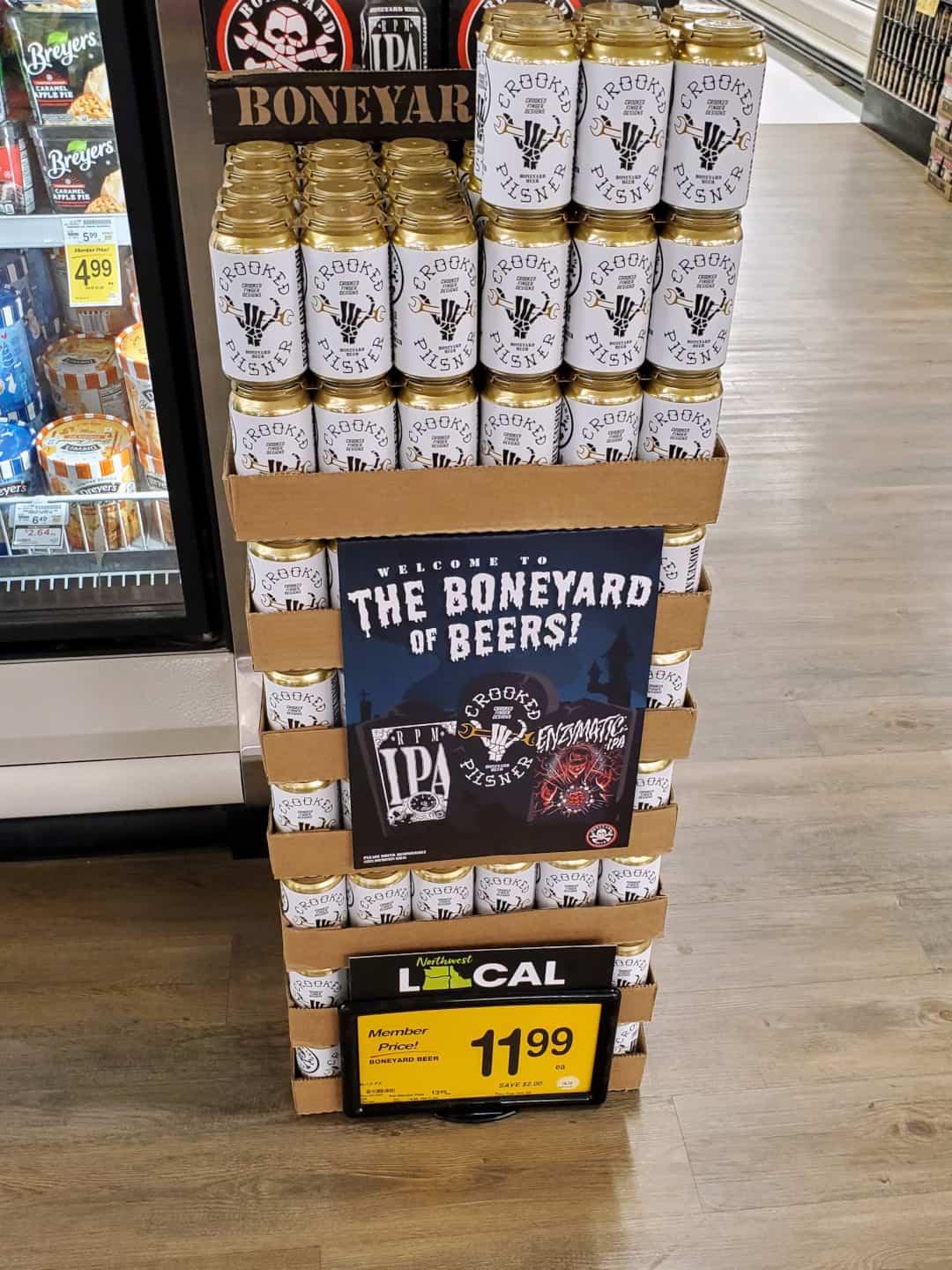
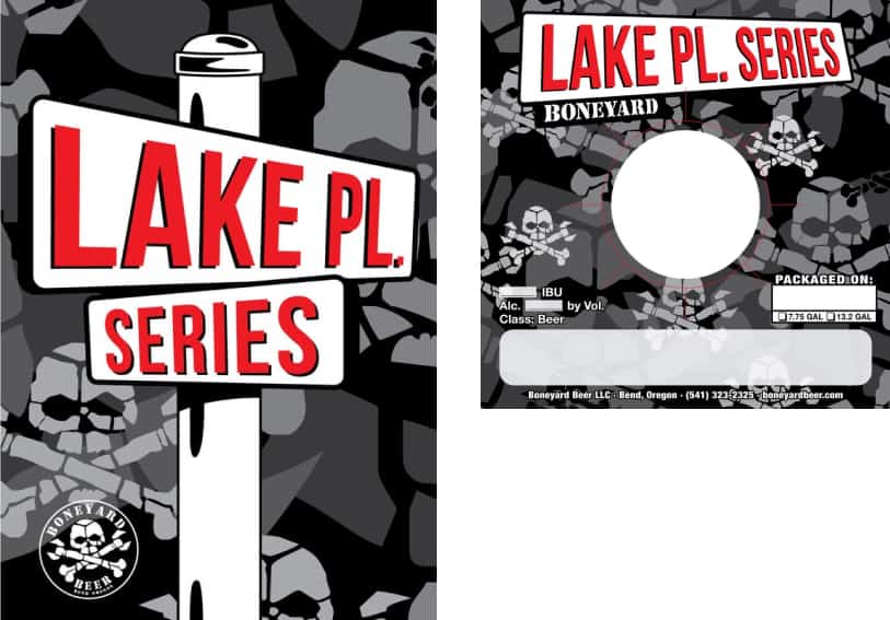
Boneyard POS
Every retail brand must be present at the point-of-sale in order to drive awareness and purchase intent of their product. Boneyard was no different. My approach bridged the gap between between packaging and brand by relying on shared elements and typography. We leveraged the camouflage all-over skull pattern seen on the bottom panel of the packaging as a key element in communications moving forward. Meanwhile, displaying the unmistakable logo and brand colors of black (mostly) and red drive our point home with a beautiful contrast.
Date:
April 12, 2023